
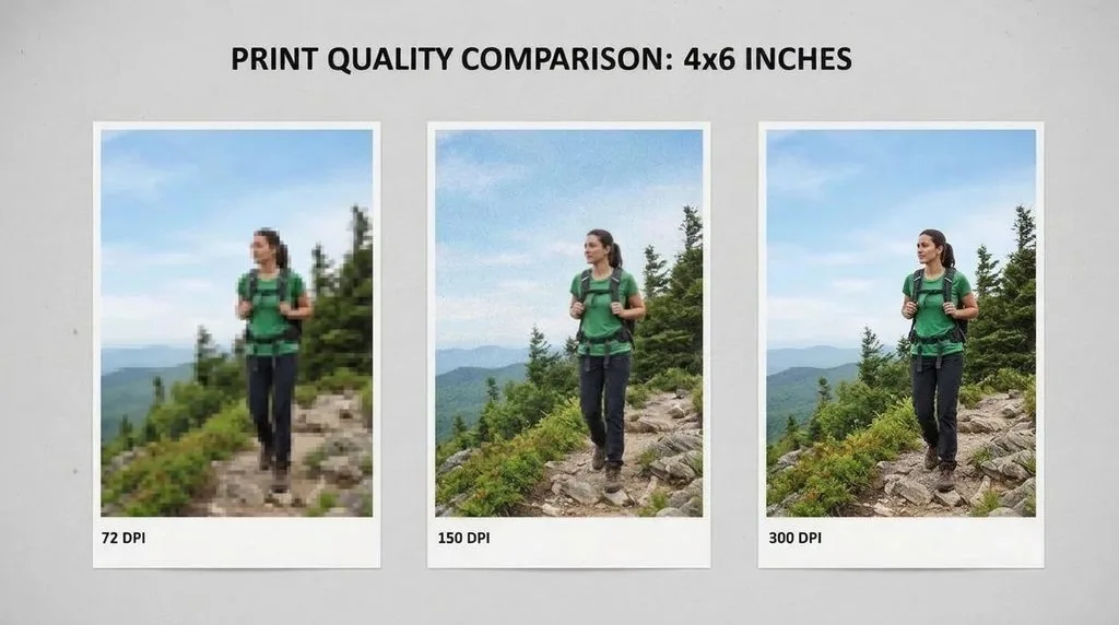
Quick answer: For anything you hold and look at up close — photos, business cards, brochures, flyers — 300 DPI is the gold standard. Large posters and banners viewed from a few feet away look fine at 150–200 DPI. Billboards and building wraps can go as low as 72–100 DPI. And 72 DPI is for screens only — it will look blurry and pixelated on paper. One formula rules them all: pixels needed = print size in inches × target PPI. Keep reading and you will never send a blurry file to the printer again.
Let me tell you about the poster that still haunts me. I designed it at 72 DPI because it looked sharp on my laptop. Afterward, I sent it to the printer and paid $80 for the print. It came back looking like a blurry watercolor. I hung it up anyway, and every time I walked past it I remembered: the screen lies. A file can look flawless on your monitor and fall apart on paper, because your screen and your printer speak two completely different languages. This guide is the lesson I wish I had before that poster.
We are going to cover what DPI actually means, why it is not the same thing as PPI, exactly which DPI to use for every kind of print, how to calculate the pixel size your file really needs, how to check and fix DPI in Photoshop and Canva, and the non-DPI factors (paper, ink, sharpening, color mode) that can ruin a print even when your DPI is perfect. I read through the top guides from print labs and product printers to make sure this covers everything they do — and the gaps they leave. Grab a coffee and let’s dive in.
1. What Is DPI? (And Why It Is Not PPI)
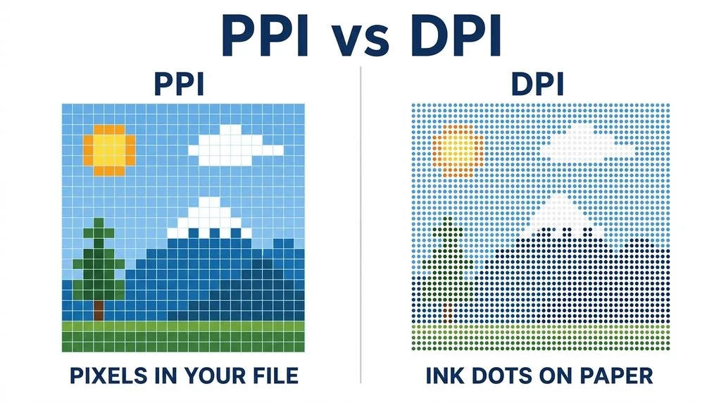
Here is the confusion almost every guide skips over. DPI means dots per inch — it describes how many tiny ink dots a printer lays down in one linear inch of paper. It is a printer measurement. PPI means pixels per inch — it describes how many pixels your digital file packs into one inch. It is a file measurement. People use the two words interchangeably, and that is exactly why so many prints come out wrong.
Your printer’s DPI is usually fixed and high — consumer inkjets often run at 1200, 2400, or even 4800 DPI. That is not the number you control. The number you control is your file’s PPI. When someone says “send me a 300 DPI file,” what they really mean is “send me a file with enough pixels to equal 300 pixels per inch at the final print size.” The official definition of dots per inch goes deep into printer mechanics if you want the full story, but for your purposes, PPI is the dial you turn.
The single biggest mistake people make is checking the DPI number in their file properties and thinking it means something on its own. It does not. A 300 DPI file that is only 600 pixels wide will still print blurry at 8×10 inches. DPI only matters when you pair it with the actual pixel dimensions and the final print size. We will do that math next.
2. The Best DPI for Every Kind of Print
There is no single “best” DPI — there is the best DPI for how far away people will stand when they look at it. Up close, your eye can resolve fine detail, so you need more pixels. Far away, the detail blurs together naturally, so you can get away with fewer. This is the principle that lets billboards exist at shockingly low resolution.
| Print type | Viewing distance | Recommended PPI | Notes |
|---|---|---|---|
| Business cards, invitations | Arm’s length | 300 | Small text must be razor sharp |
| Photo prints (4×6, 8×10) | Arm’s length | 300 | Gold standard for photo labs |
| Brochures, flyers, booklets | Arm’s length | 300 | Text and images both |
| Posters (18×24, 24×36) | 1–3 feet | 150–200 | 300 is safer if file allows |
| Canvas wraps, wall art | 2–5 feet | 150 | Canvas texture hides softness |
| Banners, trade-show graphics | 5+ feet | 100–150 | Viewed from a distance |
| Billboards, building wraps | 20+ feet | 50–100 | Giant size, low resolution |
| Fine art / archival prints | Arm’s length | 300–600 | For gallery-grade detail |
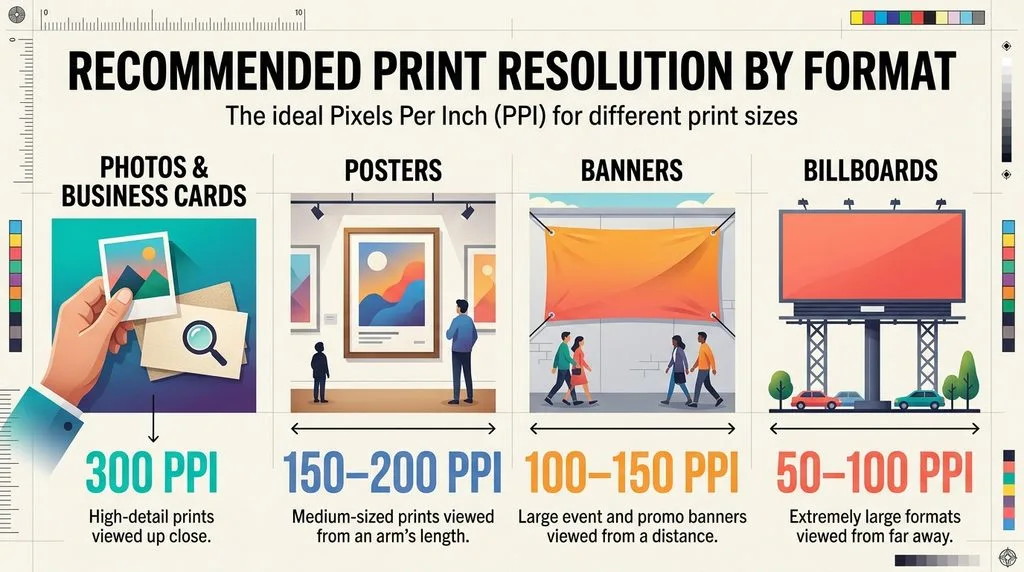
The science behind this is pixel density and how the human eye resolves detail. At a normal reading distance (about 10–12 inches), 300 PPI sits right around the limit of what your eye can distinguish. That is why 300 became the industry standard — go higher and you mostly just get a bigger file, go lower and you start to see pixels. For posters, step back a few feet and that same 300 PPI is overkill; 150 looks identical from where people actually stand.
3. 150 DPI vs 300 DPI: Is There Really a Difference?
This is the question print shops hear every day, and the honest answer is: it depends on size and distance. At small sizes (4×6, business cards) viewed up close, yes — 150 DPI will look visibly softer, and text may look slightly fuzzy. At poster size viewed from across the room, most people cannot tell 150 from 300, and the 300 file just takes longer to upload and print.
My rule of thumb: if your file can comfortably hit 300 PPI at the print size, use 300 — there is no downside except file size. If your file is too small to reach 300, 150 is your floor for anything with text or fine detail. Below 150, only go there for genuinely large-format work viewed from far away. And never, ever upscale a 72 DPI web image to 300 DPI and think you fixed it — we will cover why in Section 5.
4. The Exact Pixel Sizes You Need (The Formula)
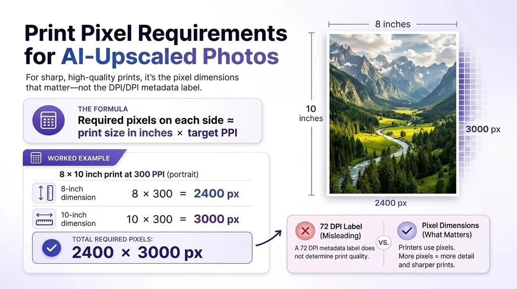
Forget the DPI number in your file. The only thing that matters is your total pixel count relative to the print size. Here is the formula:
Pixels needed = print width in inches × target PPI (same for height).
Example: an 8×10 print at 300 PPI needs 8×300 = 2400 pixels wide and 10×300 = 3000 pixels tall — so a 2400×3000 pixel file. Adobe’s guide to image size walks through this in Photoshop if you want the step-by-step.
Here are the minimum pixel dimensions for common print sizes at 300 PPI — save this table:
| Print size | Minimum pixels (300 PPI) |
|---|---|
| 4×6 | 1200 × 1800 |
| 5×7 | 1500 × 2100 |
| 8×10 | 2400 × 3000 |
| 11×14 | 3300 × 4200 |
| 16×20 | 4800 × 6000 |
| 18×24 poster | 5400 × 7200 |
| 24×36 poster | 7200 × 10800 |
| A4 (8.3×11.7) | 2480 × 3508 |
If your file falls short of these numbers, you have three honest options: print smaller, accept lower PPI (fine for large format), or find a higher-resolution original. Upscaling in software adds pixels but not detail — it can make a file bigger without making it sharper.
5. How to Check and Change DPI in Photoshop, Canva, and Your Phone
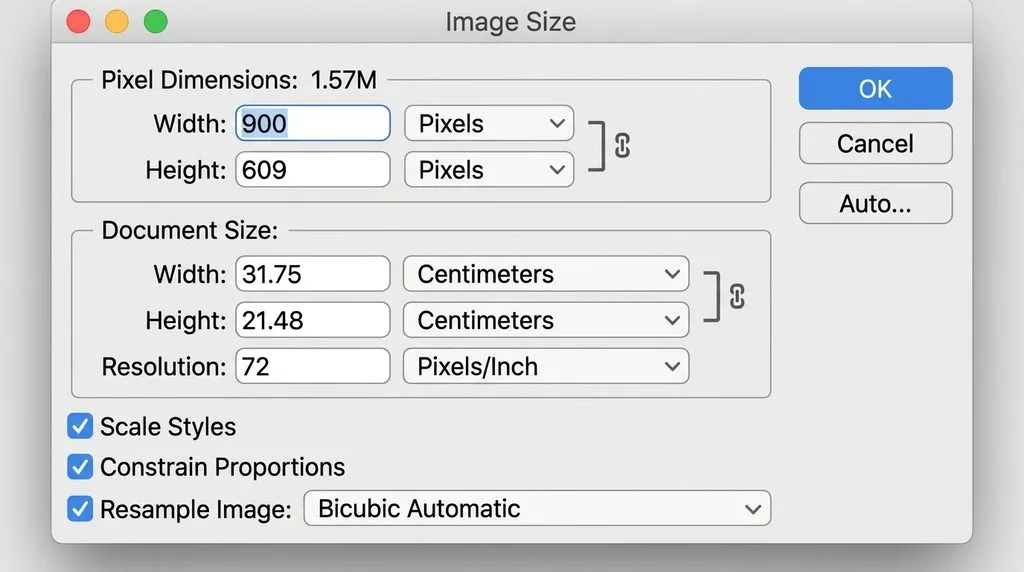
Checking your file’s real resolution takes ten seconds. In Photoshop, go to Image > Image Size and look at the pixel dimensions plus the resolution field. In Canva, download as PDF Print (which embeds 300 DPI) or check the file info after export. On your phone, open the photo details — an iPhone or modern Android will show you the pixel dimensions; then divide width by the print width in inches to get PPI.
If you need to resize a photo to exact print dimensions without distorting it, an image resizer lets you type in the exact pixel or inch target and handles the math. The key habit: always resize down from a larger original when you can. Resizing up is where quality falls apart.
6. Sharpening: The Secret Sauce Most People Skip
Even a perfect 300 DPI file can print slightly soft if you never sharpened it. Screens make images look sharper than they really are; paper soaks up ink and softens edges. A light sharpening pass — especially on eyes, text, and fine detail — is the difference between a print that looks “fine” and one that looks professionally done.
If you want to do it right, learn how to sharpen an image without creating ugly halos. The standard approach is a small amount of sharpening after resizing to the final print size, because resizing itself softens the image. Go easy — over-sharpened prints look crunchy and unnatural.
7. RGB vs CMYK: The Color Mode Trap
Here is another way a perfect-DPI print can still look wrong. Your screen uses RGB (red, green, blue) light. Printers use CMYK (cyan, magenta, yellow, black) ink. The two color spaces do not overlap perfectly — bright neon blues and greens on screen often come out duller in print. If you design in RGB and send it straight to a CMYK printer, colors can shift unexpectedly.
The official CMYK color model explains the science, but the practical advice is simple: ask your printer which color space they want, and convert before you send the file. Many online printers accept RGB and convert automatically, but professional offset printers and high-end labs will want CMYK or a specific profile. When in doubt, ask — a one-line email saves a whole reprint.
8. Retouch and Color Grade Before You Print (Not After)
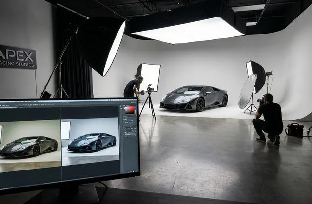
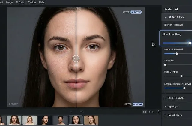
Printing reveals everything. A tiny blemish, a dust spot, or a slightly off white balance that you never noticed on screen becomes obvious on a large physical print. This is why professional photographers retouch and color grade their images before sending them to the lab, not after the print comes back.
For portraits and wedding photos, a careful pass of photo retouching before printing removes distractions and keeps the focus where it belongs. And a thoughtful color grading pass ensures the tones, contrast, and mood look exactly as you intended once they hit paper. Do both at full resolution, then resize and sharpen at the end.
9. Product and Catalog Printing: Where DPI Earns Its Keep
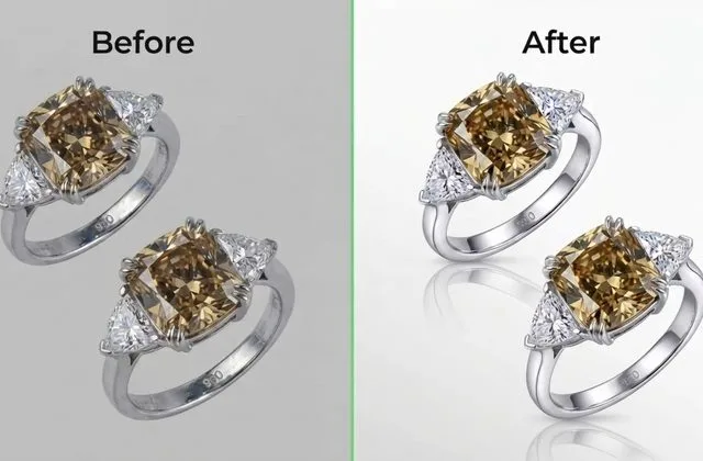
If you sell products online and print catalogs, lookbooks, or packaging, DPI is directly tied to how professional your brand looks. A blurry product photo in a printed catalog reads as cheap, and customers notice even if they cannot name why. For product prints, 300 PPI is non-negotiable, and consistent product photo editing — clean backgrounds, consistent color, sharp focus — matters just as much as the pixel count.
A pro tip for product work: keep your master files at full resolution and export print versions at 300 PPI at the exact trim size. Never pull a 72 DPI web thumbnail and blow it up for a catalog page — that is the single most common mistake in printed marketing materials.
10. Paper, Ink, and Printer: The Non-DPI Factors That Matter
Even with a perfect file, your print is only as good as the physical process. A few things to know:
- Paper matters. Glossy and coated papers hold fine detail better; matte and textured papers soften it slightly. If you print on textured fine-art paper, 300 PPI is still fine but extreme sharpness is less visible.
- Ink matters. Dye inks are vibrant but fade faster; pigment inks last decades and are standard for archival and fine-art prints.
- Printer calibration matters. A calibrated printer with the right paper profile will match your screen far better than a default home-printer setup.
- Test print first. Whenever a job is expensive or important, print one small proof at full resolution. Catching a color shift on a $2 print beats reprinting a $200 poster run.
Final Thought
DPI is not a magic number you set and forget — it is the meeting point between your digital pixels and the physical paper. Once you stop staring at the DPI label and start checking actual pixel dimensions against print size, everything clicks. 300 PPI for close work, 150 for posters, less for billboards. Sharpen after resizing, watch your color mode, and always proof before a big run. Do that, and your days of blurry, disappointing prints are over.
Frequently Asked Questions
What is the best DPI for printing?
For photos, business cards, brochures, and anything viewed up close, 300 DPI (more precisely, 300 PPI at final print size) is the standard. Large posters can use 150–200 DPI, and billboards often use 50–100 DPI because they are viewed from far away.
Is 300 DPI always better than 150 DPI?
At small sizes viewed up close, yes — 300 DPI is sharper. At poster size viewed from a distance, most people cannot tell the difference, and 150 DPI produces a much smaller file. Use 300 when your source file allows it; 150 is acceptable for large format.
Is 72 DPI good enough for printing?
No. 72 DPI is the old standard for screen display. A 72 DPI file will look blurry and pixelated when printed at any normal size. If that is all you have, print it very small or find a higher-resolution version — upscaling to 300 DPI does not add detail.
What is the difference between DPI and PPI?
DPI (dots per inch) measures how many ink dots a printer lays down per inch — it is a printer property. PPI (pixels per inch) measures how many pixels your digital file contains per inch — it is a file property. When a printer asks for 300 DPI, they really mean a file with 300 PPI at the final print size.
How many pixels do I need for a 300 DPI print?
Multiply the print size in inches by 300. For example, an 8×10 print needs 2400×3000 pixels; a 16×20 print needs 4800×6000 pixels. If your file has fewer pixels, it will not be truly 300 DPI at that size.
Can I increase DPI without losing quality?
You can change the DPI label in software, but you cannot create new detail that was not in the original. Upscaling a low-resolution file makes it bigger but not sharper. Always start with the highest-resolution original you can get.
Should I use RGB or CMYK for printing?
It depends on your printer. Many online labs accept RGB and convert automatically, but professional offset printers and fine-art labs usually want CMYK or a specific color profile. Ask your printer before you send the file to avoid color shifts.
What DPI should I use for large posters and banners?
For posters viewed from 1–3 feet away, 150–200 DPI is standard. For banners and trade-show graphics viewed from 5+ feet, 100–150 DPI works. For billboards, 50–100 DPI is common. The farther away the viewer, the lower the DPI you need.